Design Tokens for a Design System: A Practical Setup for CSS, Tailwind, React and WordPress
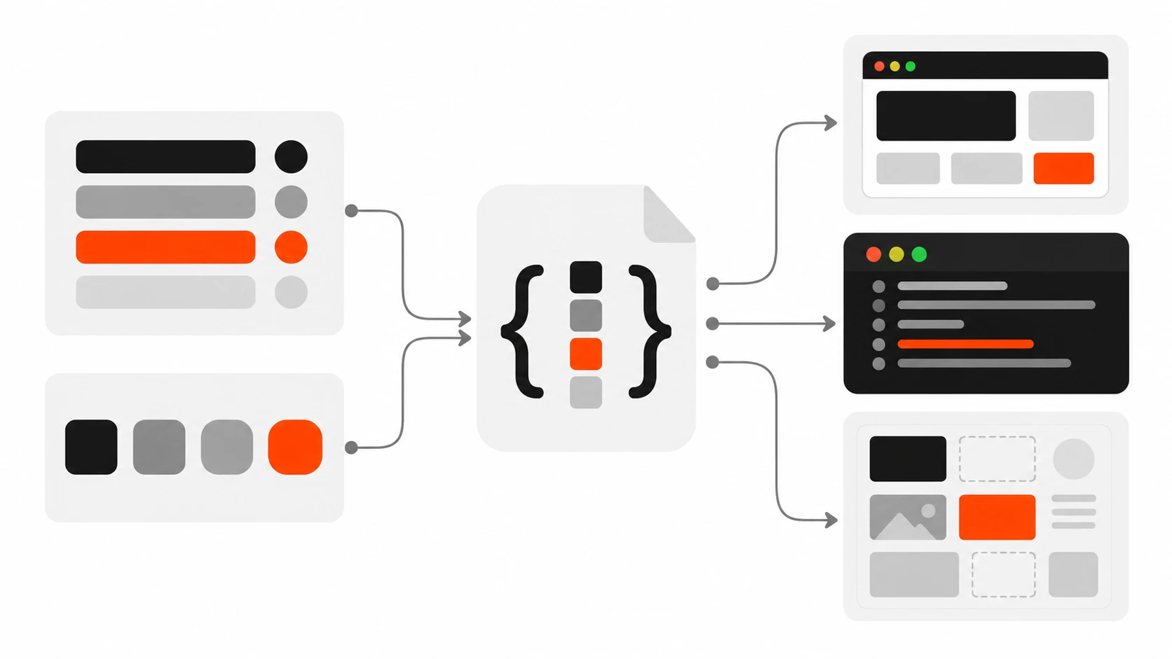
Last year I took over a client project where the brand orange existed in 23 slightly different versions. Some were hex, some were rgb(), one was written as a Tailwind arbitrary value, and two lived inside a WordPress block pattern nobody remembered creating. When the client asked for a “small brand refresh”, what should have been a one-hour change turned into three days of search and replace, plus a week of finding the ones I missed.
That project is the reason I now set up design tokens on almost every build, even small ones. In this guide I will walk you through exactly how I do it as a freelance web developer: how I structure tokens in three tiers, how I write them in the W3C Design Tokens format, how Style Dictionary turns them into CSS custom properties, how dark mode falls out almost for free, and how the same tokens feed Tailwind, React components and a WordPress theme.json file. I will finish with the mistakes I see most often when I review other people’s token setups.
What design tokens actually are
Design tokens are named design decisions stored as data. Instead of writing #FF3E00 in forty places, you store it once as a token like color.brand.500, and then every platform reads that value from the same source. Colors are the obvious example, but spacing, font sizes, font weights, line heights, border radius, shadows, durations and easing curves are all good token candidates.
The important word is decisions. A token is not just a variable. A CSS custom property called --orange is a variable. A token called color.action.primary says what the value is for, and that meaning is what makes a design system survive a rebrand, a dark mode request, or a second developer joining the project.
The other big benefit is that tokens are platform neutral. They live in JSON, so the same file can generate CSS variables for the website, a JavaScript object for a React Native app, a Tailwind theme, and the palette inside the WordPress editor. Designers and developers stop arguing about which file is the source of truth because there is only one.
The three tiers: primitive, semantic, component
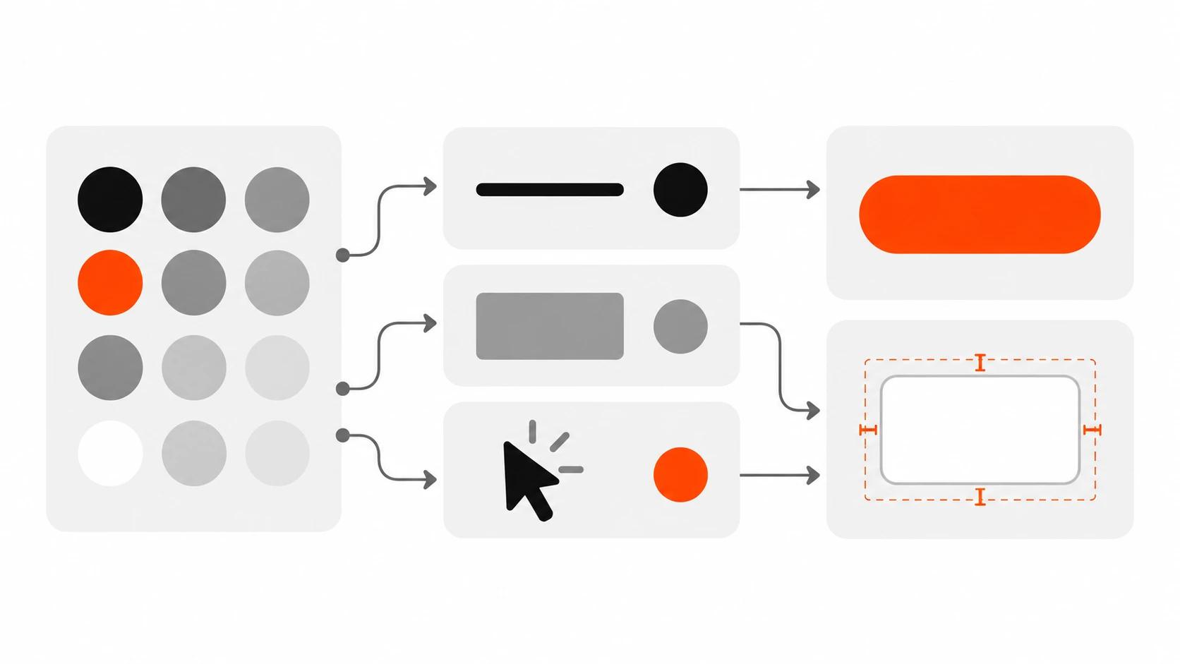
Most token setups that go wrong are flat. Someone exports every color from Figma, names them by appearance, and uses them directly in components. It works until the first theme change. The structure I use, and the one most mature design systems settle on, has three tiers.
Tier 1: primitive tokens
Primitives are the raw palette. They describe what a value looks like, not where it is used: color.orange.500, color.gray.900, space.4, radius.lg. You can have plenty of them. The rule is that components never use primitives directly.
Tier 2: semantic tokens
Semantic tokens describe purpose: color.text.default, color.surface.raised, color.action.primary, color.border.subtle. Each one points to a primitive. This is the tier that changes between light and dark mode, or between two brands sharing one codebase. If you only build one tier well, build this one.
Tier 3: component tokens
Component tokens are scoped to a single component: button.primary.background, card.padding, input.border.focus. They point to semantic tokens. I only add them when a component genuinely needs to diverge, or when a client wants to tweak one component without touching the whole system. On small marketing sites I often skip this tier completely, and that is fine.
The chain looks like this: button.primary.background points to color.action.primary, which points to color.orange.500, which is #FF3E00. Change the primitive and the whole site follows. Change the semantic mapping and only the meaning shifts. That separation is the entire point.
Writing tokens in the W3C Design Tokens format
For years every tool had its own JSON shape. The W3C Design Tokens Community Group (DTCG) fixed that with a shared format, and it reached its first stable version (2025.10) in October 2025. Style Dictionary, Tokens Studio, and a growing list of design tools now read it, so I use it for every new project.
The format is simple. Any object with a $value is a token. $type says what kind of value it is (color, dimension, fontFamily, fontWeight, duration, cubicBezier, shadow and so on), and $description is an optional note. The dollar sign prefix keeps those reserved keys separate from your own group names. An alias, meaning a token that points to another token, is written with curly braces around the path.
// tokens/primitives.json
{
  "color": {
    "$type": "color",
    "orange": {
      "500": { "$value": "#FF3E00" },
      "600": { "$value": "#D93500" }
    },
    "gray": {
      "50":  { "$value": "#FFFFFF" },
      "100": { "$value": "#F2F2F2" },
      "500": { "$value": "#888888" },
      "900": { "$value": "#1E1E1E" },
      "950": { "$value": "#000000" }
    }
  },
  "space": {
    "$type": "dimension",
    "2": { "$value": "0.5rem" },
    "4": { "$value": "1rem" },
    "6": { "$value": "1.5rem" }
  },
  "radius": {
    "$type": "dimension",
    "lg": { "$value": "12px" }
  }
}
Notice that $type sits on the group. Child tokens inherit it, which keeps the file short. In the stable spec, color values can also be written as objects with a color space and components, but plain hex strings are still the most widely supported form across tools today, so I keep hex unless a client needs wide gamut colors. Check what your tool version accepts before you commit to one style.
Now the semantic layer, built entirely from aliases:
// tokens/semantic.json
{
  "color": {
    "$type": "color",
    "text": {
      "default": { "$value": "{color.gray.950}" },
      "muted":   { "$value": "{color.gray.500}" }
    },
    "surface": {
      "page":   { "$value": "{color.gray.50}" },
      "raised": { "$value": "{color.gray.100}" }
    },
    "action": {
      "primary":       { "$value": "{color.orange.500}" },
      "primary-hover": { "$value": "{color.orange.600}" }
    }
  }
}
Not a single hex code in that file. If you ever see a raw value in your semantic tokens, treat it as a bug.
Turning tokens into CSS custom properties with Style Dictionary
JSON on its own does nothing in a browser. Style Dictionary is the tool I use to transform tokens into whatever each platform needs. Version 4 and later support the DTCG format directly, and the config is a plain JavaScript file.
npm install -D style-dictionary// sd.config.mjs
import StyleDictionary from 'style-dictionary';
const sd = new StyleDictionary({
source: ['tokens/primitives.json', 'tokens/semantic.json'],
platforms: {
css: {
transformGroup: 'css',
buildPath: 'dist/tokens/',
files: [
{
destination: 'variables.css',
format: 'css/variables',
options: { outputReferences: true }
}
]
},
js: {
transformGroup: 'js',
buildPath: 'dist/tokens/',
files: [{ destination: 'tokens.js', format: 'javascript/es6' }]
}
}
});
await sd.buildAllPlatforms();Run node sd.config.mjs and you get a variables.css file that looks roughly like this:
:root {
  --color-orange-500: #ff3e00;
  --color-gray-950: #000000;
  --color-text-default: var(--color-gray-950);
  --color-action-primary: var(--color-orange-500);
  --space-4: 1rem;
  --radius-lg: 12px;
}
The outputReferences: true option is the one I always turn on. Without it, Style Dictionary resolves every alias to its final value, so --color-action-primary becomes a hard-coded hex. With it, the semantic variable keeps pointing at the primitive variable, which is exactly what you want for theming in the browser and for debugging in DevTools.
I add the build to my package.json scripts as "tokens": "node sd.config.mjs" and run it before the main build, so generated files never drift from the JSON. I also commit the generated CSS on WordPress projects, because many hosts will not run a Node build step on deploy.
Dark mode theming with semantic tokens
This is where the three tiers pay for themselves. Dark mode does not need new primitives and it should not need new component code. It only needs a different semantic mapping.
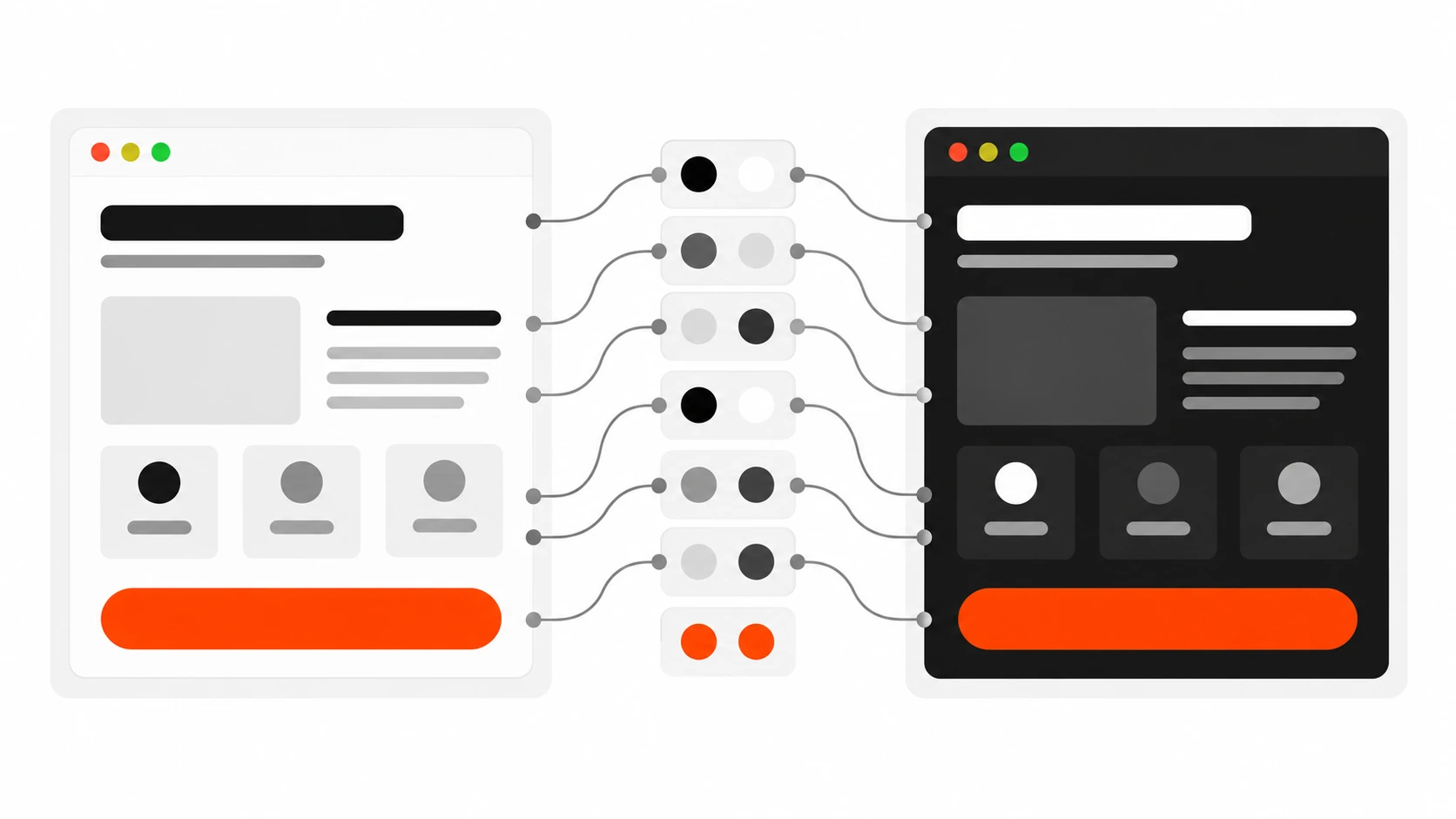
I keep a second semantic file, tokens/semantic-dark.json, with the same token names pointing to different primitives. Then I add a second CSS file in the Style Dictionary config, wrapped in a different selector. In recent versions, the css/variables format accepts a selector option, and a filter lets you output only the semantic tokens for the dark file.
{
  destination: 'dark.css',
  format: 'css/variables',
  filter: (token) => token.filePath.includes('semantic-dark'),
  options: { selector: '[data-theme="dark"]', outputReferences: true }
}
Because the dark file redefines names that already exist, you need a separate Style Dictionary build (or instance) for the dark theme so the two sets do not collide in one dictionary. I usually create one instance per theme in a small loop. The output is clean:
[data-theme="dark"] {
  --color-text-default: var(--color-gray-50);
  --color-surface-page: var(--color-gray-900);
  --color-surface-raised: #2a2a2a;
}
Every component that uses var(--color-surface-page) switches theme automatically when you set data-theme="dark" on the html element. If you want to follow the operating system setting, wrap the same block in @media (prefers-color-scheme: dark) and let the data attribute override it when the user picks a theme manually. One practical tip: check contrast for both themes at the semantic level, not component by component. If color.text.muted passes on color.surface.page in both themes, every component using that pair passes too.
Using tokens in Tailwind and React
Tokens should not force a styling approach. On React projects I use them three ways, depending on the stack.
Tailwind CSS v4
Tailwind v4 is configured in CSS with the @theme directive, and theme values are exposed as CSS variables. That makes token integration straightforward: point Tailwind’s theme variables at your semantic variables.
/* app.css */
@import "tailwindcss";
@import "./dist/tokens/variables.css";
@import "./dist/tokens/dark.css";

@theme inline {
  --color-text: var(--color-text-default);
  --color-muted: var(--color-text-muted);
  --color-surface: var(--color-surface-page);
  --color-primary: var(--color-action-primary);
  --radius-card: var(--radius-lg);
}
Now bg-primary, text-muted and rounded-card exist as utilities, and they follow dark mode because they reference variables instead of fixed values. The inline keyword tells Tailwind to use the variable reference inside the utility instead of resolving it at build time. If you are still on Tailwind v3, the same idea works in tailwind.config.js with colors: { primary: 'var(--color-action-primary)' }.
The key habit: only expose semantic tokens to Tailwind, not the whole primitive palette. If bg-orange-500 is available, someone will use it, and you are back to the 23-oranges problem.
Plain React components
With CSS Modules or plain CSS, components just use the variables. For component tokens, I define them at the component level so they are easy to override:
/* Button.module.css */
.button {
  --button-bg: var(--color-action-primary);
  --button-bg-hover: var(--color-action-primary-hover);
  background: var(--button-bg);
  padding: var(--space-2) var(--space-4);
  border-radius: var(--radius-lg);
}
.button:hover { background: var(--button-bg-hover); }
When I need values in JavaScript, for example for a chart library or a canvas animation, I import the generated tokens.js file instead of copying hex codes into the component. The values still come from the same JSON.
Mapping design tokens to WordPress theme.json
A lot of my client work is WordPress, and block themes have their own token system: theme.json. Colors in settings.color.palette, sizes in settings.typography.fontSizes and spacing in settings.spacing.spacingSizes become presets that WordPress outputs as CSS variables like --wp--preset--color--primary, and they show up in the editor UI for content editors.
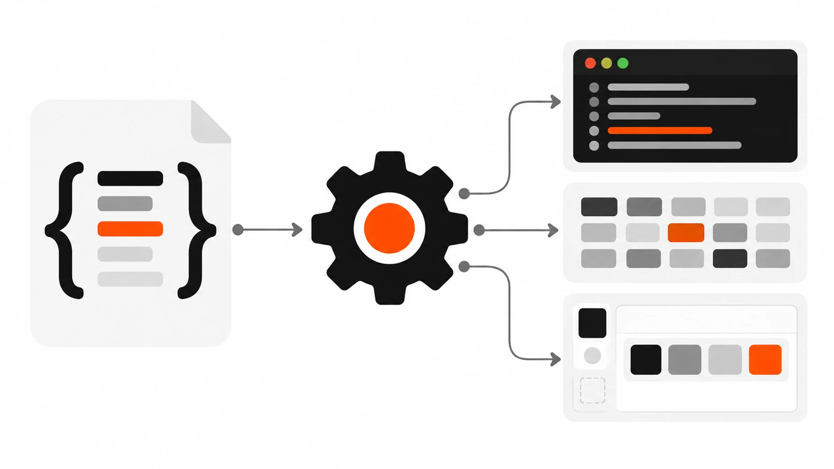
The mistake is maintaining theme.json by hand next to a separate token file. Instead I generate the relevant parts of theme.json from the same tokens. Style Dictionary lets you register a custom format, so a small function can write the palette:
StyleDictionary.registerFormat({
  name: 'wp/theme-json-palette',
  format: ({ dictionary }) => {
    const palette = dictionary.allTokens
      .filter((t) => t.path[0] === 'color' &&
        ['text', 'surface', 'action'].includes(t.path[1]))
      .map((t) => ({
        slug: t.path.slice(1).join('-'),
        name: t.path.slice(1).join(' '),
        color: t.$value
      }));
    return JSON.stringify({ settings: { color: { palette } } }, null, 2);
  }
});
I merge that output into the theme’s theme.json with a tiny Node script during the tokens build. Editors get a short palette of named, purposeful colors (“action primary”, “surface raised”) instead of fifteen shades of gray, and the theme CSS can use either the WordPress preset variables or the Style Dictionary variables because they come from the same source.
Two notes from experience. First, theme.json palette colors need real values, so resolve aliases for this file rather than outputting var() references, which some editor color controls handle poorly. Second, for anything that is not a standard preset, such as radius or shadows on older WordPress versions, use settings.custom, which WordPress outputs as --wp--custom-- variables.
Common design token mistakes I keep fixing
These come straight from audits and handovers I have done on client projects.
- Naming semantic tokens by appearance.
color.text.orangeis not semantic. When the brand becomes green, the name lies. Name by role:color.text.accent. - Components using primitives. If a button uses
--color-orange-500directly, dark mode and rebrands skip it. Lint for it or simply do not expose primitives to component code. - Too many tokens too early. A five-page site does not need 400 component tokens. Start with primitives and 15 to 30 semantic tokens, and add component tokens only when there is a real need.
- Resolving every alias in the CSS output. Without
outputReferences, the browser sees fixed values, runtime theming breaks, and DevTools stops telling you where a value came from. - Two sources of truth. Tokens in JSON plus hand-edited theme.json, or a Figma file plus a Tailwind config edited separately. Pick one source and generate the rest.
- Ignoring units and types. A dimension token without a unit, or a font weight stored as the string “bold” in one place and 700 in another, causes subtle bugs across platforms. Use
$typeconsistently. - No documentation. Add
$descriptionto semantic tokens. Six months later, the difference betweensurface.raisedandsurface.overlaywill not be obvious to anyone, including you.
My starter setup for a new project
If you want a practical starting point, this is what I set up on day one, and it takes about an hour:
- A
tokens/folder withprimitives.json,semantic.jsonandsemantic-dark.jsonin DTCG format. - A Style Dictionary config that outputs
variables.css,dark.cssandtokens.js, withoutputReferenceson. - A
tokensscript inpackage.jsonthat runs before dev and build. - Tailwind
@theme inlinemapped to semantic variables only, or theme.json palette generated from the same tokens on WordPress. - A one-page token reference in the README so the client’s next developer knows the rules.
If the designer works in Figma, I ask them to use variables with the same naming, and sync through a plugin that exports DTCG JSON. Even when they do not, the token files become the contract between design and code.
Final thoughts
Design tokens sound like enterprise design system territory, but the biggest wins I have seen were on small and mid-size client sites. The day a client says “can we try a darker orange” or “we need dark mode by Friday”, a token setup turns panic into a two-line change. Start small, keep the three tiers clean, generate every platform from one source, and never let a component touch a primitive.
If you want help setting up a design token system for your website, React app or WordPress theme, get in touch with me and tell me about your project.