The HTML dialog Element: Accessible Modals Without a Modal Library
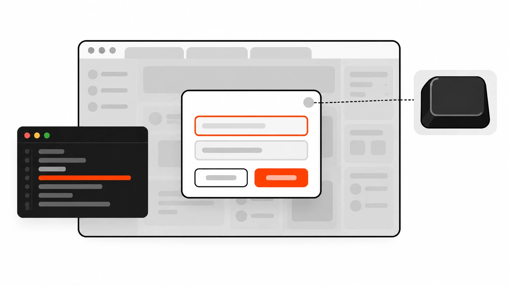
A client once sent me a Loom of their checkout confirm modal. On the recording, a keyboard user opened “Place order”, Tabbed once, and landed on the footer newsletter form behind the overlay. The page behind was still scrollable. Esc did nothing. They had shipped a custom div with role="dialog", a homemade focus trap, aria-hidden on the main content, and z-index: 9999. It looked modal. It was not.
We deleted most of that code and replaced it with the native HTML dialog element opened with showModal(). Focus stayed inside. Esc closed it. The background went inert. The confirm button used a form with method="dialog" so the close path did not need a click handler. The modal library they had planned to buy never got installed.
That is the point of this guide. The HTML dialog element has been Baseline widely available since March 2022. Used the right way, it gives you accessible modals without a modal library. Used the wrong way (show(), or toggling the open attribute), you get a fancy non-modal panel that still leaves the page wide open. Below is how I use it on client sites, what to verify in the browser, and the checklist I keep next to the PR.
Why custom div modals keep failing
I still see the same four failure modes on audits:
- Focus escapes. A
divwith a highz-indexdoes not trap Tab. Screen reader users and keyboard users walk into the page behind the overlay unless you build and maintain a focus trap. - The background stays clickable. Without making the rest of the document inert, pointer events still hit links, buttons and form fields under the dimmed layer.
- Z-index fights. Nested stacking contexts (sticky headers, CSS transforms, portals) mean “9999” is never enough. Another widget eventually paints on top.
aria-hiddenjuggling. Hiding the page for assistive tech while keeping the dialog usable is easy to get wrong, especially when content updates or React re-renders the tree.
You can patch each of those with JavaScript. Or you can call dialog.showModal() and let the browser own focus, inertness, Esc, the top layer and the backdrop.
show() vs showModal() vs the open attribute
This is the mistake I see most often, and it is the one that matches the social posts for this article.
<dialog id="confirm">
  <h2 id="confirm-title">Delete this project?</h2>
  <p id="confirm-desc">This cannot be undone.</p>
  <form method="dialog">
    <button value="cancel">Cancel</button>
    <button value="confirm" autofocus>Delete</button>
  </form>
</dialog>

<button type="button" id="open-confirm">Delete project</button>
const dialog = document.getElementById("confirm");
const openBtn = document.getElementById("open-confirm");
openBtn.addEventListener("click", () => {
dialog.showModal(); // real modal
});Three ways to “open” a dialog behave differently:
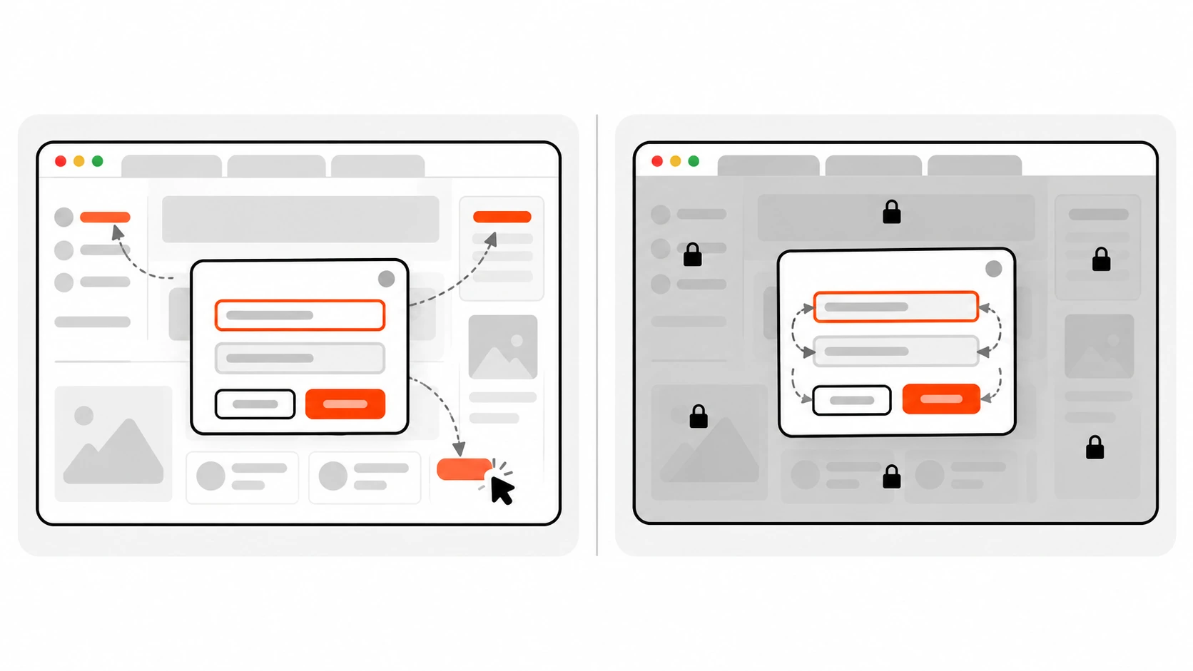
showModal()puts the dialog in the top layer, creates a::backdrop, makes the rest of the page inert, moves focus into the dialog, and closes on Esc (unless you cancel that). This is what you want for confirmations, destructive actions and anything that must own the user’s attention.show()opens a non-modal dialog. The page behind stays interactive. There is no backdrop. Esc does not close it by default. Focus is not trapped the same way. Use this for non-blocking panels, not for “are you sure?” flows.- Setting the
openattribute (includingdialog.setAttribute("open", "")ordialog.open = true) also creates a non-modal dialog. MDN and the HTML Standard recommendshow()/showModal()instead. Togglingopenby hand skips the modal path and can skip thecloseevent if you remove the attribute yourself.
If your “modal” was opened with show() or by flipping open, it is not actually modal. That is the whole bug.
Top layer and ::backdrop
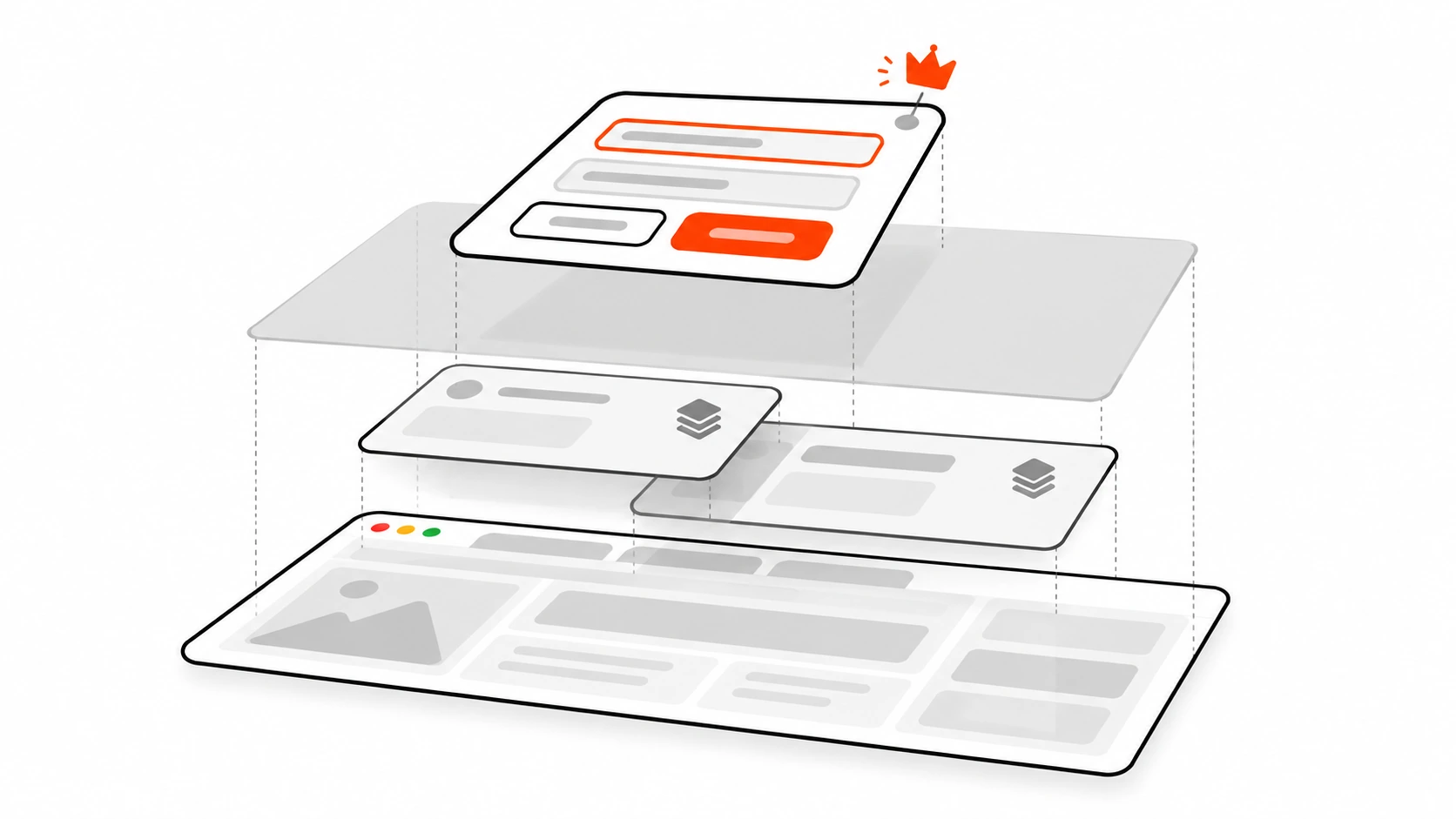
When you call showModal(), the browser adds the dialog to the top layer. That is a special paint layer above normal stacking contexts. Your sticky header, your portal, your z-index: 9999 card: none of them win against a top-layer dialog. That is why you can delete the z-index arms race.
The dimmed sheet behind a modal dialog is the ::backdrop pseudo-element. It only exists for dialogs opened with showModal(). Style it like any other element:
dialog::backdrop {
  background: rgb(0 0 0 / 0.5);
}
Non-modal dialogs (show() or the open attribute) do not get a backdrop. If you need a clickable overlay behind a non-modal panel, you are building something else (often a popover), not a modal.
Inert background
With showModal(), everything outside the dialog is made inert: it cannot receive focus or pointer events. You do not need to set aria-hidden="true" on <main> and remove it again on close. The browser also exposes modal dialogs with aria-modal="true". Non-modal dialogs are exposed as aria-modal="false".
If you still build a custom modal from a div, you would need the inert attribute (or equivalent) on the rest of the page yourself. With native modal dialogs, that work is already done.
Esc and the cancel event
Keyboard users expect Esc to dismiss a modal. For a dialog opened with showModal(), the browser fires a cancel event when the user presses Esc (or when you call requestClose()). The event is cancelable. If you call event.preventDefault() in the cancel listener, the dialog stays open. If you do not prevent it, the dialog closes and then fires close.
dialog.addEventListener("cancel", (event) => {
  // Example: block Esc while a destructive action is in flight
  if (dialog.dataset.busy === "true") {
    event.preventDefault();
  }
});

dialog.addEventListener("close", () => {
  console.log("closed with", dialog.returnValue);
});
Calling dialog.close() skips cancel and goes straight to closing. That is useful when a primary button should always close. Prefer requestClose() when you want the same cancel hooks as Esc.
form method=”dialog”, returnValue and close
You can close a dialog without writing a click handler for every button. Put a form inside the dialog and set method="dialog" (or formmethod="dialog" on a submit button):
<dialog id="confirm" aria-labelledby="confirm-title" aria-describedby="confirm-desc">
  <h2 id="confirm-title">Delete this project?</h2>
  <p id="confirm-desc">This cannot be undone.</p>
  <form method="dialog">
    <button value="cancel">Cancel</button>
    <button value="confirm">Delete</button>
  </form>
</dialog>
When that form is submitted, the dialog closes, the form is not navigated away, and dialog.returnValue becomes the value of the button that was activated ("cancel" or "confirm"). Listen for close and branch on returnValue:
dialog.addEventListener("close", () => {
  if (dialog.returnValue === "confirm") {
    deleteProject();
  }
});
If a required field is empty, the browser will block that submit until the field is valid. For a Cancel path that must ignore validation, put formnovalidate on the cancel button, or call dialog.close("cancel") from a type="button" handler.
Focus on open and focus restore on close
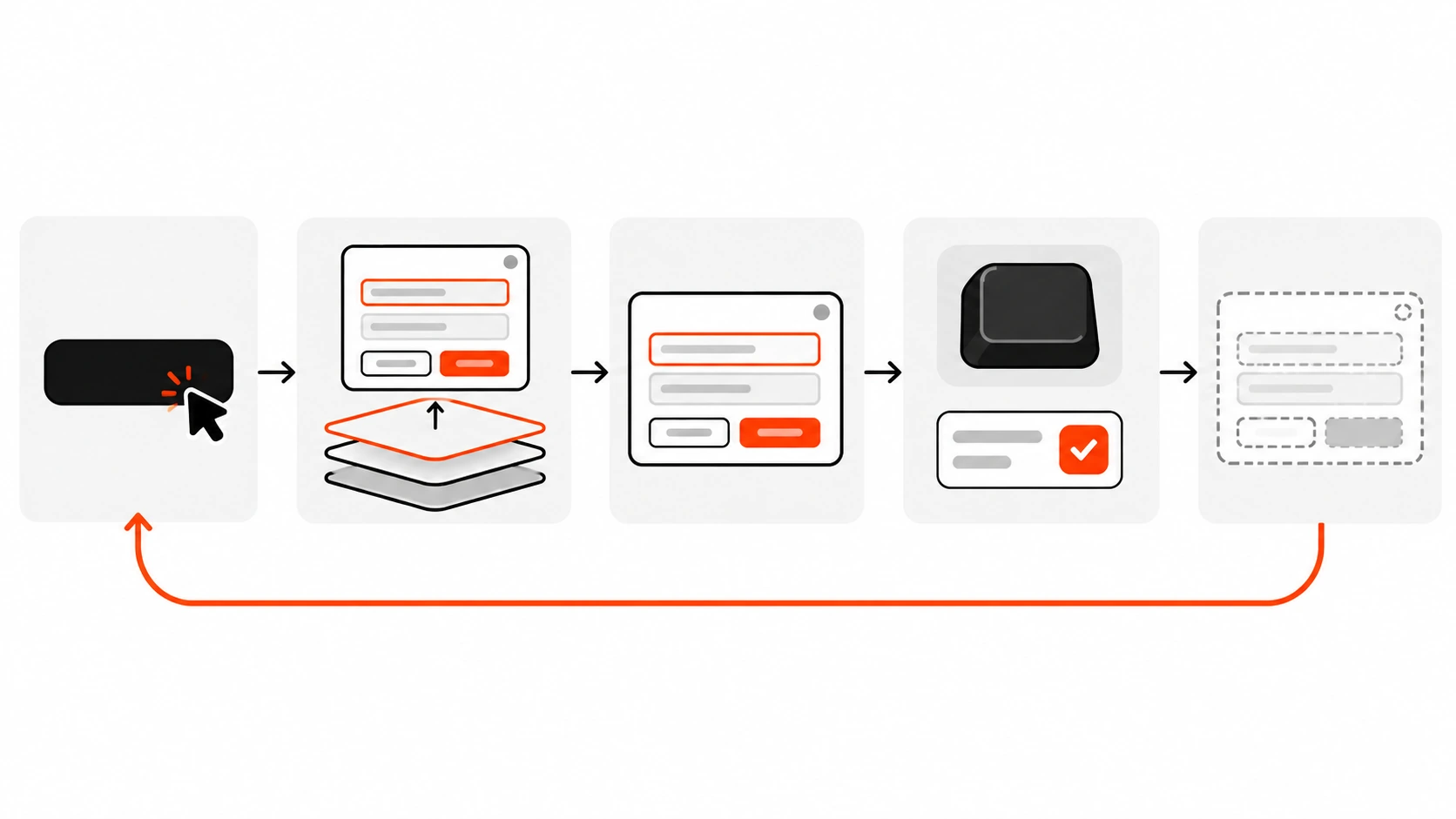
When showModal() (or show()) runs, the HTML Standard stores the previously focused element, then runs the dialog focusing steps. Those steps prefer:
- The dialog itself if it has
autofocus - Otherwise the focus delegate inside the dialog (often the first focusable control, or an element marked
autofocus) - Otherwise the dialog element
Put autofocus on the control you want first: usually the safe Cancel button for destructive dialogs, or the first field for a form dialog. Do not add tabindex to the <dialog> element itself; MDN warns against that.
When the dialog closes, the browser restores focus to the element that had focus before open (when the dialog was modal, or when focus was still inside it). That is the “curved arrow back to the trigger” behaviour in the lifecycle diagram. You do not need a manual trigger.focus() in most cases, though keeping a reference is still fine for custom flows.
Labelling with aria-labelledby and aria-describedby
The dialog element has an implicit ARIA role of dialog. Give it an accessible name and, when useful, a description:
<dialog
  id="confirm"
  aria-labelledby="confirm-title"
  aria-describedby="confirm-desc"
>
  ...
</dialog>
Point aria-labelledby at a visible heading inside the dialog. Point aria-describedby at the supporting text. Avoid a second, invisible label that drifts out of sync with what sighted users see.
Preventing background scroll
Inertness blocks interaction, but some browsers still let the document scroll behind a modal. A small CSS rule fixes that without JavaScript:
body:has(dialog[open]) {
  overflow: hidden;
}
:has() is widely supported now. If you must support a very old browser, toggle a class on document.body when you open and close. I prefer :has() on client sites unless analytics show a real gap.
Brief note on animations
Dialogs flip between display: none and a visible display value, and they enter and leave the top layer. To animate that cleanly with CSS transitions you typically need:
@starting-stylefor the “just opened” starting valuesdisplayandoverlayin the transition listtransition-behavior: allow-discreteon those discrete properties
dialog {
  opacity: 0;
  transform: translateY(0.5rem);
  transition:
    opacity 0.2s ease-out,
    transform 0.2s ease-out,
    overlay 0.2s ease-out allow-discrete,
    display 0.2s ease-out allow-discrete;
}

dialog:open {
  opacity: 1;
  transform: none;
}

@starting-style {
  dialog:open {
    opacity: 0;
    transform: translateY(0.5rem);
  }
}
If :open is missing in an older browser, dialog[open] is the attribute fallback. Keep animations short. Accessibility settings that reduce motion should still win (prefers-reduced-motion).
Light dismiss, closedby and requestClose()
“Light dismiss” means clicking the backdrop (outside the dialog) closes it. Historically you wired that yourself:
dialog.addEventListener("click", (event) => {
  if (event.target === dialog) {
    dialog.requestClose("backdrop");
  }
});
Clicks on the backdrop target the dialog element itself, so comparing event.target === dialog is the usual pattern. Prefer requestClose() here so Esc and backdrop share the same cancel hooks.
There is also a declarative attribute: closedby.
closedby="any"– Esc, developer close, and light dismissclosedby="closerequest"– Esc and developer close (no backdrop click)closedby="none"– only developer close (no Esc)
If closedby is missing, the Auto rules apply: a dialog opened with showModal() behaves like closerequest; a non-modal dialog behaves like none.
Honest support (checked October 2026): closedby works in Chrome and Edge from 134, and Firefox from 141. Safari stable still does not ship it (Technology Preview only as of this writing). So I set closedby="any" when light dismiss is desired, and I keep the click fallback above for Safari and older browsers. Feature-detect if you want: "closedBy" in HTMLDialogElement.prototype.
requestClose() itself is newer than close() but is Baseline newly available across current Chrome, Edge, Firefox and Safari (Safari from 18.4). Use it when you want cancel-before-close. Fall back to close() only if you must support older engines and do not need the cancel path.
Invoker commands (progressive enhancement)
In the latest browsers you can open and close a modal dialog with HTML alone using the Invoker Commands API:
<button command="show-modal" commandfor="confirm">Delete project</button>

<dialog id="confirm">
  <form method="dialog">
    <button value="cancel" commandfor="confirm" command="close">Cancel</button>
    <button value="confirm">Delete</button>
  </form>
</dialog>
Dialog commands include show-modal, close and request-close. MDN lists Invoker Commands as Baseline newly available since December 2025. That means current evergreen browsers, not every older phone still in the wild. I treat command / commandfor as progressive enhancement and still keep a showModal() listener (or ensure a polyfill path) until your audience fully covers it.
React and Next.js usage
In React (including Next.js client components) keep a ref to the dialog and call the imperative methods. Do not drive modals only by rendering open on the JSX attribute if you need a real modal:
"use client";

import { useEffect, useRef } from "react";

type Props = {
  open: boolean;
  onClose: (value: string) => void;
};

export function ConfirmDialog({ open, onClose }: Props) {
  const ref = useRef<HTMLDialogElement>(null);

  useEffect(() => {
    const el = ref.current;
    if (!el) return;
    if (open && !el.open) el.showModal();
    if (!open && el.open) el.close();
  }, [open]);

  return (
    <dialog
      ref={ref}
      aria-labelledby="confirm-title"
      onClose={() => onClose(ref.current?.returnValue ?? "")}
    >
      <h2 id="confirm-title">Delete this project?</h2>
      <form method="dialog">
        <button value="cancel">Cancel</button>
        <button value="confirm" autoFocus>
          Delete
        </button>
      </form>
    </dialog>
  );
}
Notes from real projects:
- Sync React state from the native
onClose/onCancelevents so Esc and form submit stay in sync with youropenprop. - Portal concerns mostly go away for stacking, because top layer beats z-index. You still need the dialog in the DOM (often near the root) so it is not trapped inside an
overflow: hiddenancestor that clips non-top-layer content before open. - Server Components cannot call
showModal(). Keep the dialog in a client component.
WordPress and block themes
On WordPress sites I usually drop a small vanilla module in the theme or a mu-plugin rather than pulling a modal plugin. A pattern that works well with block themes:
- Output the
<dialog>markup in a template part or a custom block save/render callback. - Enqueue a few lines of JS that query
dialogelements and wire[data-open-dialog]buttons toshowModal(). - Style
dialoganddialog::backdropintheme.jsonstyles or a small CSS file.
Because the behaviour lives in the platform, you avoid another admin-ajax dependency and another accessibility bug farm. If a page builder insists on its own modal, keep native dialog for theme-owned UI (cookie consent confirmations, delete confirms in custom tables, membership gates) where you control the markup.
Testing with Playwright and the keyboard
Automated tests catch the show() mistake quickly if you assert the right things:
import { test, expect } from "@playwright/test";

test("confirm dialog is modal", async ({ page }) => {
  await page.goto("/projects");
  await page.getByRole("button", { name: "Delete project" }).click();

  const dialog = page.getByRole("dialog", { name: "Delete this project?" });
  await expect(dialog).toBeVisible();

  // Focus should be inside the dialog
  await expect(page.locator("dialog[open] button[value='confirm']")).toBeFocused();

  // Page behind should not take a click while modal
  await page.keyboard.press("Escape");
  await expect(dialog).toBeHidden();

  // Focus returns to the trigger
  await expect(page.getByRole("button", { name: "Delete project" })).toBeFocused();
});
Also Tab through the open dialog manually (or with Playwright keyboard) and confirm focus does not land on the footer. If it does, you almost certainly used show() or the open attribute instead of showModal().
My HTML dialog checklist
Before I merge a modal PR I tick these:
- Open with
showModal()for anything that must block the page. Nevershow()orsetAttribute("open")for that case. - Label with
aria-labelledby(andaria-describedbywhen there is supporting text). - Put
autofocuson the intended first control. - Prefer
<form method="dialog">plusreturnValuefor confirm/cancel. - Listen for
close(andcancelwhen you need to block Esc). - Style
dialog::backdrop; do not invent a second overlaydivfor modal cases. - Lock background scroll with
body:has(dialog[open]) { overflow: hidden; }(or a class toggle). - For light dismiss, set
closedby="any"and keep aclickfallback while Safari stable catches up. - In React, drive open/close through a ref and
useEffect, and sync state from native events. - Add a Playwright (or similar) test that opens with the keyboard, presses Esc, and checks focus restore.
- Delete the old z-index hacks, custom focus traps and
aria-hiddenon<main>once the native path is green.
What you can delete
After a clean showModal() migration, these usually go in the bin:
z-index: 9999/10000overlay stacks- Hand-rolled focus trap helpers
aria-hidden="true"toggles on the page shell- Extra full-screen
divbackdrops behind the dialog - “Press Esc to close” keydown listeners that duplicate the browser
Keep a visible close or cancel control even when Esc works. Not every device has a physical Escape key, and clear buttons help everyone.
Wrapping up
The HTML dialog element is not a new toy API. It is the platform’s answer to the modal problem we kept re-solving with libraries. The sharp edge is simple: showModal() is modal; show() and the open attribute are not. Get that call right, wire method="dialog", label the dialog, and you can ship accessible confirms without another dependency.
If you already have a modal library, try replacing one low-risk confirm dialog this week. Keep the checklist above next to the PR. When focus stays inside, Esc works, and the backdrop is just ::backdrop, you will feel how much code you no longer need to own.