LCP Image Optimization: Make Your Hero Image Load First With fetchpriority, Preload, and srcset
The message usually looks the same: “Search Console says our mobile LCP is poor, but the site feels fast on my laptop.” I have answered some version of it for WordPress shops, Next.js marketing sites, and headless storefronts. This story is stitched together from a few of those audits, because the same mistakes keep repeating.
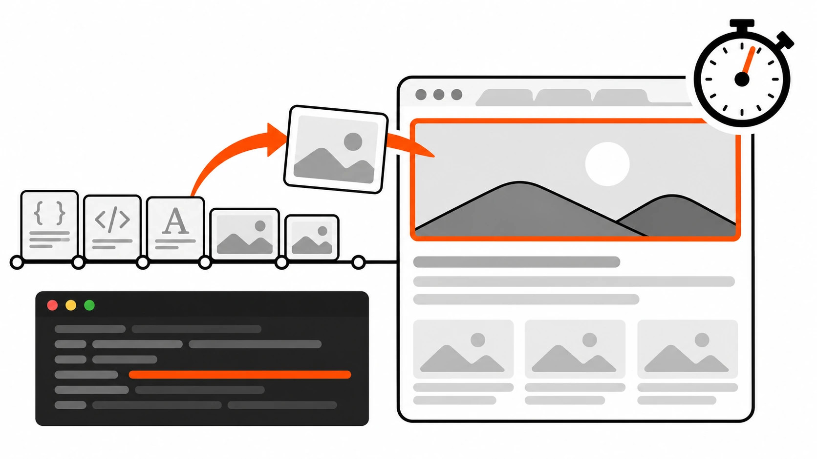
The home page had a big hero banner: a slider with three slides, a headline, and a “Shop now” button. On a fast desktop connection it looked instant. On a mid-range phone, the hero took more than four seconds to appear. When I opened the waterfall, the hero image did not even start downloading until well after the HTML, the CSS, the slider script, and a pile of icons. Three separate problems were stacked on top of each other: the first slide was a CSS background image, the slider swapped real URLs in from data-src with JavaScript, and a lazy-loading plugin had added loading="lazy" to every image on the page, the hero included.
None of the fixes were exotic. A real <img> tag for the first slide, fetchpriority="high" on it, no lazy-loading above the fold, low priority for the hidden slides, and a srcset that stopped sending a 2400 pixel file to a 400 pixel wide phone. Over the next 28-day field window, mobile LCP moved from the poor bucket to comfortably under 2.5 seconds.
This guide is the playbook I use for that kind of fix. It is focused on the most common case: your Largest Contentful Paint element is an image. I will cover how to find the LCP element, the four parts of LCP time, why lazy-loading and CSS backgrounds hurt, how fetchpriority and preload actually differ, responsive images with srcset and sizes, and what Next.js and WordPress core already do for you (and where they guess wrong).
What LCP measures, and why the image is usually the problem
Largest Contentful Paint is one of the three Core Web Vitals. It reports the render time of the largest image, text block, or video visible in the viewport, measured from the moment the user started navigating to the page. Google’s guidance is that a good LCP is 2.5 seconds or less, measured at the 75th percentile of page loads, split by mobile and desktop.
The elements that can become the LCP element are limited on purpose:
<img>elements (for animated images, the first frame counts)<image>elements inside an<svg><video>elements (the poster image or the first frame, whichever is earlier)- An element with a background image loaded through
url() - Block-level elements that contain text
A few details matter in practice. Only the visible part inside the viewport counts toward the size, so a huge image that is mostly cropped off-screen can lose to a headline. For a resized image, the browser uses the smaller of the displayed size and the intrinsic size. Chromium also ignores elements it considers non-contentful, such as invisible elements with zero opacity, full-viewport backgrounds, and low-entropy placeholder images.
On most marketing pages, product pages, and blog posts with a featured image, the winner is an image. Text LCP is usually fast because the text is in the HTML. Image LCP is slow because the image is a separate request that the browser has to discover, prioritize, download, and paint. Every one of those steps is something you control.
Find your LCP element before you touch anything
The biggest waste of time I see is optimizing the wrong image. Before changing markup, I confirm three things: does the page actually have an LCP problem for real users, which element is the LCP element, and which part of the timeline is slow.
Start with field data. PageSpeed Insights shows Chrome User Experience Report (CrUX) data at the top for the URL and for the whole origin, on mobile and desktop. If CrUX and the Lighthouse lab score disagree, trust CrUX, because it reflects your real visitors. Search Console’s Core Web Vitals report groups similar URLs, which is great for spotting templates that share a problem.
Then open Chrome DevTools, go to the Performance panel, and record a page load with CPU and network throttling that roughly matches your users. In the Insights sidebar, two insights do most of the work for image LCP:
- LCP breakdown splits the LCP time into its subparts (older Chrome versions called it “LCP by phase”).
- LCP request discovery checks three things about the LCP image: whether
fetchpriority=highis applied, whether the request is discoverable in the initial HTML document, and whether lazy-loading is correctly not applied.
If you want the element without DevTools, this snippet logs every LCP candidate as the page loads. The last one before any user input is your LCP element:
new PerformanceObserver((list) => {
  for (const entry of list.getEntries()) {
    console.log("LCP candidate", Math.round(entry.startTime), entry.element, entry.url);
  }
}).observe({ type: "largest-contentful-paint", buffered: true });
For real-user monitoring, I use the attribution build of the web-vitals library. It hands you the same four subparts that DevTools shows, so you can see which one is slow on real phones:
import { onLCP } from "web-vitals/attribution";

onLCP(({ value, attribution }) => {
  const { target, url, timeToFirstByte, resourceLoadDelay, resourceLoadDuration, elementRenderDelay } = attribution;
  navigator.sendBeacon("/rum", JSON.stringify({
    lcp: Math.round(value), target, url,
    ttfb: Math.round(timeToFirstByte),
    loadDelay: Math.round(resourceLoadDelay),
    loadDuration: Math.round(resourceLoadDuration),
    renderDelay: Math.round(elementRenderDelay),
  }));
});
The four parts of LCP time
The web.dev team breaks every LCP into four subparts with no gaps and no overlap between them:
- Time to First Byte (TTFB): from the start of navigation until the first byte of HTML arrives.
- Resource load delay: the gap between TTFB and the moment the browser starts downloading the LCP image.
- Resource load duration: how long the image itself takes to download.
- Element render delay: the gap between the image finishing and the element actually being painted.
Their rough target for a well-optimized page is about 40 percent TTFB, under 10 percent load delay, about 40 percent load duration, and under 10 percent render delay. The two “delay” parts should be close to zero. In other words, almost all of your LCP time should be spent downloading the HTML and the image, not waiting around between them.
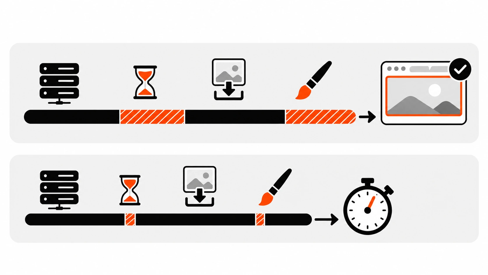
This framing changes what you fix first. In the audits I do, the biggest chunk of wasted time is almost always resource load delay: the image starts late. Compressing the file only shrinks load duration, and if the image is also blocked from rendering by JavaScript, the saved time simply moves into render delay and LCP does not change at all. So I work in this order: start the image earlier, let it render as soon as it arrives, make it smaller, and then look at the server.
Mistake 1: lazy-loading the LCP image
Native lazy-loading is one of the best things to happen to image performance, which is exactly why it gets applied everywhere. The problem is that loading="lazy" tells the browser to wait until layout confirms the image is near the viewport. For a hero image, that means the request cannot start until the CSS has loaded and layout has run. web.dev puts it bluntly: never lazy-load your LCP image.
Here is the before and after I apply most often:
<!-- Before: the hero waits for layout -->
<img src="/img/hero-1600.webp" alt="Oak dining table in a bright room"
     width="1600" height="900" loading="lazy">

<!-- After: eager by default, high priority -->
<img src="/img/hero-1600.webp" alt="Oak dining table in a bright room"
     width="1600" height="900" fetchpriority="high">
You do not need loading="eager" in plain HTML, because eager is already the default. Leaving the attribute off is enough. Keep the width and height attributes though. They let the browser reserve the right box before the file arrives, which protects your CLS score.
JavaScript lazy-loading libraries are worse than native lazy-loading for the hero. They usually ship markup like <img data-src="hero.webp" class="lazyload"> with no real src. The browser’s preload scanner, which reads ahead in the HTML and starts image downloads early, sees nothing to download. The image only starts after the library script loads, runs, and swaps the attribute. If a plugin or theme does this, exclude the hero (most of them have an exclusion setting by class or by “first N images”) or drop the library and use native lazy-loading for images below the fold.
Mistake 2: hiding the LCP image from the preload scanner
The fastest image request is one the browser can see in the first chunk of HTML. The preload scanner can discover an image when it is an <img> with src or srcset in the server-rendered markup. It cannot discover it when:
- The image is a CSS
background-image, because the browser has to download and parse the stylesheet first. - The
<img>is inserted by JavaScript, for example a client-side rendered React component or a slider that builds slides at runtime. - The real URL is hidden in
data-srcordata-srcsetfor a lazy-loading script.
The best fix is boring: render a real <img> in the HTML. For a full-bleed hero, object-fit: cover on an absolutely positioned image gives you the same look as background-size: cover:
<section class="hero">
  <img class="hero__img" src="/img/hero-1600.webp" alt="" width="1600" height="900" fetchpriority="high">
  <div class="hero__content">
    <h1>Handmade furniture, delivered</h1>
  </div>
</section>

<style>
  .hero { position: relative; min-height: 70vh; }
  .hero__img { position: absolute; inset: 0; width: 100%; height: 100%; object-fit: cover; }
  .hero__content { position: relative; }
</style>
When the hero really must stay a CSS background, or the image is only referenced from JavaScript, preload it with a high fetch priority so it starts at the same time as the stylesheet:
<link rel="stylesheet" href="/css/site.css">
<link rel="preload" as="image" href="/img/hero-1600.webp" type="image/webp" fetchpriority="high">
One note on that empty alt="" above. If the hero is purely decorative and the headline carries the meaning, an empty alt is correct. If the image itself carries information, like a product photo, write a real description.
fetchpriority=”high”: the one-attribute fix
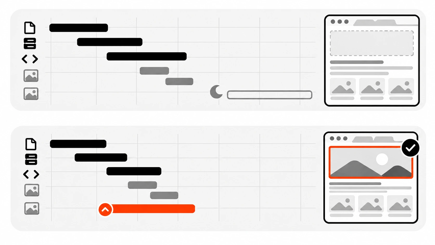
Even a perfectly discoverable image does not get top priority by default. In Chrome, images start at Low priority. Once layout runs, images inside the viewport get boosted to High. Since Chrome 117, the first five large images get Medium priority up front to speed this up. That boost still arrives late compared to CSS and scripts in the head.
fetchpriority="high" lets the image start at High immediately, before layout. In web.dev’s Google Flights experiment, adding it to the LCP background image moved LCP from 2.6 seconds to 1.9 seconds. Results on your site will differ, but on pages where the hero competes with fonts, scripts, and other images, it is often the biggest single win.
It is also widely supported now: Chrome and Edge 102, Safari 17.2, and Firefox 132. Browsers that do not understand it just ignore it, so there is no downside to adding it.
A few rules keep it useful:
- Use it on one image, two at most. If everything is high priority, nothing is. web.dev notes that setting high priority on more than one or two images makes it unhelpful for LCP.
- It is a hint, not a command. The browser can still apply its own judgment when there are conflicts.
- Use
fetchpriority="low"for images that are in the markup but not visible yet, like slides two to four of a carousel. They may be close enough to the viewport to get boosted, and they will load even withloading="lazy", so low priority is the right tool there. - Never combine
loading="lazy"withfetchpriority="high"on the same image. They contradict each other. WordPress core even triggers a “doing it wrong” notice if it sees both.
For a carousel, the pattern looks like this:
<div class="carousel">
  <img src="/img/slide-1.webp" alt="Oak dining table" width="1600" height="900" fetchpriority="high">
  <img src="/img/slide-2.webp" alt="Walnut bookshelf" width="1600" height="900" fetchpriority="low">
  <img src="/img/slide-3.webp" alt="Linen sofa" width="1600" height="900" fetchpriority="low">
</div>
Preload vs fetchpriority: when each one helps
People mix these up all the time, so here is the short version:
- Preload fixes discovery. It tells the browser “you will need this file,” which matters when the file is hidden in CSS or JavaScript. It is a mandatory fetch, not a hint. On its own, an image preload still gets the default image priority.
fetchpriorityfixes priority. It does not help the browser find anything. It changes how urgently the browser fetches what it already found.
If your LCP image is a normal <img> near the top of server-rendered HTML, you usually do not need a preload at all. fetchpriority="high" on the tag is enough. If you do preload, put fetchpriority="high" on the preload as well. Chrome’s LCP request discovery insight explicitly flags an image preload that is missing it.
Responsive images can be preloaded too. The imagesrcset and imagesizes attributes on a preload link mirror srcset and sizes on the image, so the browser preloads the same candidate it will later pick for the <img>:
<link rel="preload" as="image" fetchpriority="high"
      href="/img/hero-1600.webp"
      imagesrcset="/img/hero-640.webp 640w, /img/hero-1024.webp 1024w, /img/hero-1600.webp 1600w"
      imagesizes="100vw">
Keep the values identical to the image, or the browser may preload one file and then download a different one for the <img>, which is worse than no preload. Also avoid preloading several formats of the same image. If you use <picture> with AVIF and WebP sources, MDN’s advice is to preload only the format most of your users will actually use, with a type attribute so browsers without support skip it.
Responsive images: srcset and sizes without over-downloading
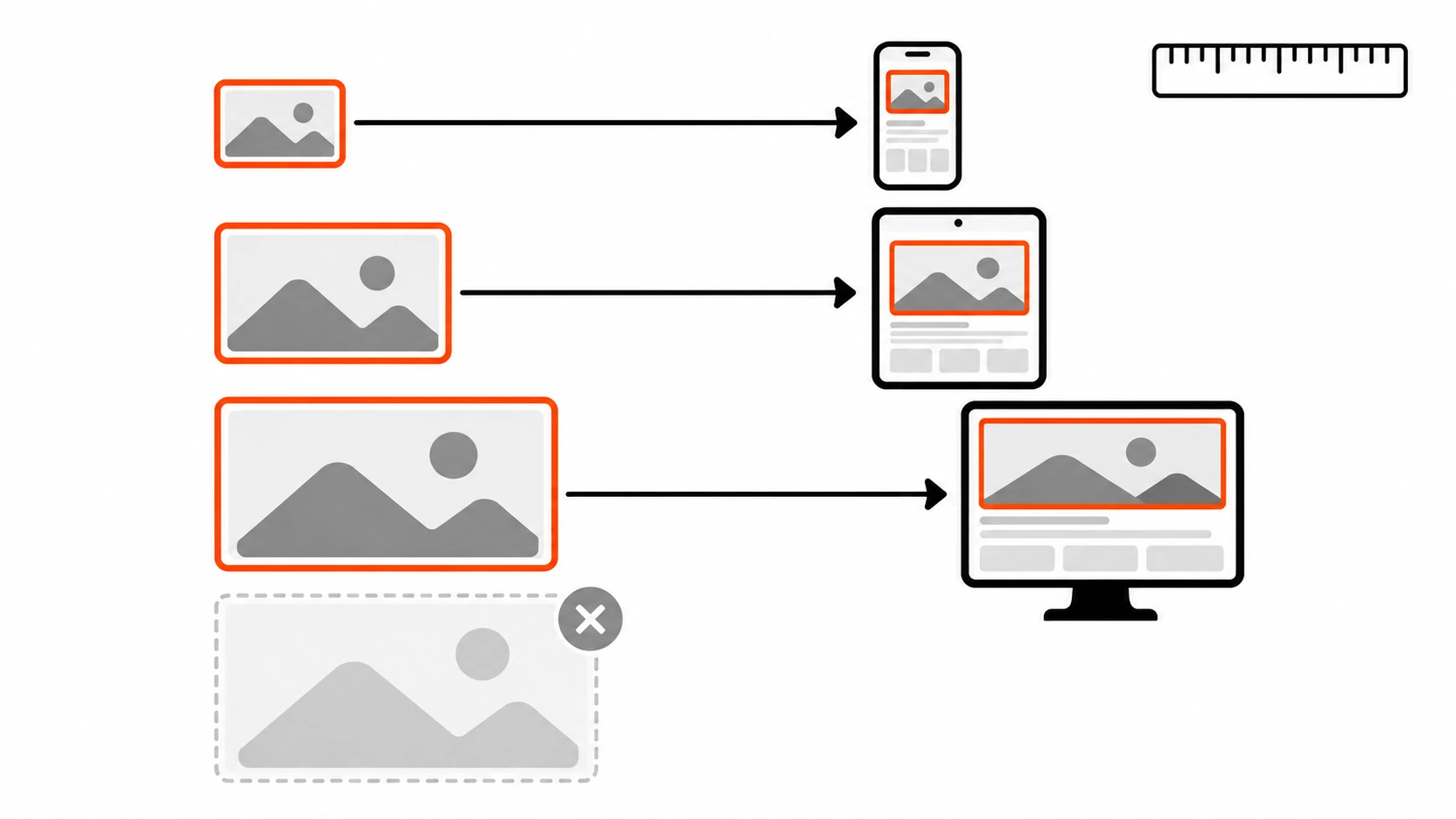
Once the image starts early, the next question is how many bytes it costs. The most common waste I find is a single large file served to every screen. A 2400 pixel hero is great on a 27 inch monitor and pointless on a phone.
With width descriptors in srcset, you list the real pixel widths of each file, and sizes tells the browser how wide the image will be displayed. The browser does the math, including the device pixel ratio, and picks one candidate:
<img
  src="/img/hero-1024.webp"
  srcset="/img/hero-640.webp 640w, /img/hero-1024.webp 1024w, /img/hero-1600.webp 1600w, /img/hero-2400.webp 2400w"
  sizes="(max-width: 900px) 100vw, 1200px"
  width="1600" height="900"
  alt="Oak dining table in a bright room"
  fetchpriority="high">
The w value must match the file’s real intrinsic width. If sizes is missing, the browser assumes the image is as wide as the viewport, which is fine for a full-bleed hero and wasteful for a card in a three-column grid.
For formats, <picture> lets browsers pick AVIF or WebP and fall back to JPEG. Put fetchpriority on the inner <img>, because that is the element that actually loads:
<picture>
  <source type="image/avif" srcset="/img/hero-1024.avif 1024w, /img/hero-1600.avif 1600w" sizes="100vw">
  <source type="image/webp" srcset="/img/hero-1024.webp 1024w, /img/hero-1600.webp 1600w" sizes="100vw">
  <img src="/img/hero-1600.jpg" width="1600" height="900" alt="Oak dining table in a bright room" fetchpriority="high">
</picture>
There is one newer detail worth knowing. The sizes attribute now accepts an auto keyword that lets the browser use the image’s real layout width. Per MDN, it is only valid together with loading="lazy". That is a good thing for below-the-fold images, but it also means sizes="auto" should never appear on your LCP image, because your LCP image should never be lazy.
Finally, remember that a smaller file only helps if the delay parts are already fixed. As web.dev points out, load duration is often not the main bottleneck. Check the breakdown first.
Next.js: priority is deprecated, here is what to use
For years the answer in Next.js was “add priority to the hero <Image>.” Starting with Next.js 16, the priority prop is deprecated in favor of a new preload prop. The next/image docs are careful about when to use it: in most cases they recommend loading="eager" or fetchPriority="high" instead, and they say not to use preload when several images could be the LCP element depending on the viewport, or together with loading or fetchPriority.
Two defaults matter here. next/image lazy-loads by default, so a hero without any of these props is a lazy-loaded LCP image. And without a sizes prop, a fill image gets a srcset built as if it spans the full viewport. This is what I use for a full-width hero in the App Router:
import Image from "next/image";
import hero from "./hero.jpg";

export default function Hero() {
  return (
    <section style={{ position: "relative", minHeight: "70vh" }}>
      <Image
        src={hero}
        alt="Oak dining table in a bright room"
        fill
        sizes="100vw"
        loading="eager"
        fetchPriority="high"
        style={{ objectFit: "cover" }}
      />
    </section>
  );
}
If you are still on Next.js 15 or earlier, priority is the right prop for your version. It is only deprecated going forward, so upgrade it when you move to 16. And a static import like the one above gives you the width, height, and blur placeholder data automatically.
One trap specific to React apps: if the hero is rendered by a client component that waits for data, the <img> does not exist in the server HTML, and no attribute can fix discovery. Render the hero on the server (Server Components or static generation) so the tag is in the first response.
WordPress: what core already does, and where it guesses wrong
WordPress core has quietly done a lot of LCP work since version 6.3. The key function is wp_get_loading_optimization_attributes(), which runs for images output through core functions like wp_get_attachment_image(), featured images, and images in post content. Reading the source, this is what it does:
- It adds
decoding="async"to images. - It only adds
loadingorfetchpriorityto images that havewidthandheight. - It skips
loading="lazy"for the first content images in the main query. The number is controlled by thewp_omit_loading_attr_thresholdfilter, and the default changed from 1 to 3 in WordPress 6.3. - It adds
fetchpriority="high"to the first image it believes is in the viewport, but only once per page and only if the image is at least 50,000 square pixels. That threshold is thewp_min_priority_img_pixelsfilter. - If you set
fetchpriority="high"yourself, core respects it and does not add another one. - Since 6.7, lazy-loaded images with a
sizesattribute getautoadded to the front of it, which is safe because those images are lazy by definition.
That is a sensible default for a standard blog theme. It goes wrong when the real hero is not one of the images core can see or count: a page builder slider that prints its own markup, a hero set as a CSS background in the theme, a lazy-load plugin that rewrites every src to data-src, or a large logo or banner above the hero that grabs the single fetchpriority="high" slot.
When I control the theme, I make the hero explicit instead of trusting the heuristic:
// In the template that prints the hero (for example single.php or a hero block).
echo wp_get_attachment_image(
    get_post_thumbnail_id(),
    'full',
    false,
    array(
        'fetchpriority' => 'high',
        'loading'       => false, // false omits the loading attribute entirely.
        'sizes'         => '(max-width: 900px) 100vw, 1200px',
    )
);
Passing false for loading tells core to leave the attribute off, and passing fetchpriority yourself means core will not hand that slot to some other image. If your layout puts more than three images above the fold in the content area, raise the threshold:
add_filter( 'wp_omit_loading_attr_threshold', function () {
    return 4;
} );
Then check the actual rendered HTML, not the editor. View source on the live page, find the hero <img>, and confirm: real src and srcset, no loading="lazy", exactly one fetchpriority="high" on the page, and width and height present. If you use a caching or optimization plugin, check its lazy-load exclusions too, because it may be rewriting images after core is done.
A note for headless WordPress, which is how my own site works: if a React or Next.js front end renders the page, core’s attributes only arrive if you output WordPress’s HTML as is. If your front end builds its own <img> tags from REST data, the front end owns all of this, and the Next.js section above applies instead.
Do not forget render delay and TTFB
Sometimes the image starts early and downloads fast, and LCP is still slow. That is element render delay, and the usual causes are:
- Large render-blocking stylesheets or synchronous scripts in the head that are still loading when the image arrives.
- An A/B testing or personalization script that hides the page until it decides what to show.
- Client-side rendering, where the element is not in the DOM until a JavaScript bundle runs.
- Long tasks on the main thread. Images are painted on the main thread, so a busy thread delays the paint.
And everything sits on top of TTFB. A slow server pushes every other subpart later. Redirect chains from ads or short links, a CDN that cannot cache because of tracking query parameters, and slow origin rendering are the usual suspects. I covered the server side in my WordPress TTFB guide and caching headers in my Cache-Control guide. Serve the hero from the same origin as the HTML when you can, because a third-party image host adds a new connection before the first byte of the image can arrive.
My LCP image checklist
- Confirm the problem in field data (CrUX in PageSpeed Insights or Search Console) before changing anything.
- Identify the LCP element per template, on mobile and desktop separately.
- Check the LCP breakdown. If resource load delay is large, fix discovery and priority first.
- Make the hero a real
<img>in the server HTML, not a CSS background or adata-src. - Remove
loading="lazy"from the LCP image and addfetchpriority="high". One image per page. - Give hidden carousel slides
fetchpriority="low". - Preload only when the image is hidden from the preload scanner, and put
fetchpriority="high"on the preload too. - Serve a responsive
srcsetwith an honestsizes, in WebP or AVIF, withwidthandheightset. - In Next.js 16, use
loading="eager"plusfetchPriority="high"(orpreload) on the hero instead of the deprecatedpriority. - In WordPress, check the rendered HTML for the hero, and pass
fetchpriorityandloadingexplicitly when a slider, builder, or plugin hides it from core. - Re-measure in the lab right away, then watch field data over the next 28 days.
Wrapping up
LCP image optimization sounds like a compression problem, but most of the time it is a scheduling problem. The browser is perfectly capable of loading your hero quickly. It just needs to see the image in the HTML, know that it matters, and not be told to wait for layout.
In the audits behind this post, the fix was rarely more than a handful of attributes and one template change. The slow part was finding the right element and admitting that the lazy-loading plugin everyone loved was the thing holding the hero back. Start with the breakdown, fix the delays, then shrink the bytes. Your phone users will notice before Search Console does.