Skeleton Screens vs Spinners vs Progress Bars: When to Use Each
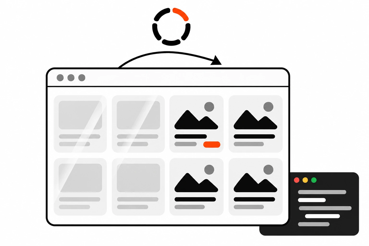
Every app has to wait for something. A list comes back from an API, a page streams in from the server, a file uploads. What the user sees during that wait matters more than most teams think. Skeleton screens, spinners and progress bars all say “hang on”, but they say it in different ways, and picking the wrong one makes a fast app feel slow.
I’ve shipped all three, and I’ve also shipped the bad versions. Spinners that flash for 80 milliseconds. Skeletons that look nothing like the page and make everything jump when the data lands. Progress bars that sit at 99% for half a minute. This post is the set of rules I use now.
Key takeaways
- Use a skeleton screen when a page or a large region is loading and you know roughly what it will look like.
- Use a spinner for short, small waits on a single component or button, roughly a few seconds at most.
- Use a determinate progress bar for anything over about 10 seconds, or any process you can measure, like an upload.
- Don’t show any loader for responses under about a second. Delay it, and keep it on screen long enough to avoid flicker once it does appear.
- Make the skeleton match the real layout so nothing shifts when content arrives. That protects your CLS score.
- Mark loading regions with
aria-busy, announce status with a polite live region, and stop the shimmer underprefers-reduced-motion.
Short answer: show nothing for waits under about one second. Use skeleton screens when a full page or a big section loads and its layout is known, a spinner for brief waits on one small element, and a determinate progress bar when the wait is long or measurable, like uploads and exports that take over 10 seconds.
What is a skeleton screen?
A skeleton screen is a placeholder version of a page that shows gray blocks in the shape of the content that’s about to load: lines for text, boxes for images, circles for avatars. It tells users the app is working and what the page will look like, so the wait feels shorter and the switch to real content feels smooth.
Think of it as a wireframe of the real page that’s rendered instantly. The user sees the shape of a card grid or a profile header before any data exists.
Nielsen Norman Group describes three kinds in Skeleton Screens 101:
- Static skeletons, plain gray boxes that mirror the final layout.
- Animated skeletons, the same boxes with a pulse or a shimmer that moves across them.
- Frame-display skeletons, which only show the header, footer and an empty background.
They recommend against the last one, and I agree. A frame with no content shapes is just a blank page with a nicer border. It gives the user nothing to read and nothing to expect.
The real value of a skeleton is that it sets expectations. A big rectangle with two short lines under it says “image with a caption is coming”. The brain starts building a picture of the page before the page exists.
When should you use skeleton screens instead of a spinner?
Use skeleton screens instead of a spinner when a whole page or a large region is loading, the wait is likely between one and ten seconds, and you know the layout in advance. Skeleton screens shine on feeds, dashboards, product grids and detail pages, where showing the structure early helps users get oriented.
The NN/g guidance is pretty clear on this. Skeletons are for full page loads and big content areas. Spinners are better for a single module, like one card on a dashboard or a video player.
A few situations where I always reach for a skeleton:
- A route change in a single page app where the new page needs data.
- A list or table whose rows come from an API.
- A dashboard with several independent widgets that load at different speeds.
- An infinite scroll feed loading its next batch.
And a few where a skeleton is the wrong tool:
- A button that submits a form. Put a small spinner in the button and disable it.
- A file upload or export. That’s a process, not a page load, so it needs a progress bar.
- Content with an unpredictable shape, like a search that might return one result or fifty. A generic skeleton here often lies about the layout.
When is a spinner the better choice?
A spinner is the better choice for short waits on a single element, like a button, a small widget or a refresh of one card. It says the system is busy without promising a layout. Keep spinners to waits of a few seconds, because an endless spinner gives users no idea whether anything is still happening.
Spinners are honest about one thing: they don’t know how long this will take. That’s fine for a two second save. It’s not fine for a 40 second report.
The same NN/g article puts spinners at waits of roughly 2 to 10 seconds. Below that, they flash past. Above that, people start to wonder if the app froze.
Two habits that make spinners better:
- Put the spinner where the action happened. If the user clicked Save, the spinner goes in the Save button, not in the middle of the screen.
- Add a short label like “Saving…” or “Loading comments”. A spinning circle on its own says busy, but not busy with what.
When should you use a determinate progress bar?
Use a determinate progress bar when the wait will likely be longer than about 10 seconds, or when you can measure progress, like bytes uploaded or records processed. A bar that fills from 0 to 100% tells users how long they’ll wait, so they can decide to stay, switch tabs or cancel.
Uploads are the obvious case. The browser gives you progress events, so there’s no reason to show a spinner for a 200 MB video.
Batch jobs are another. “Importing contact 340 of 1,200” is far more reassuring than a spinner, even if the job is quick. You don’t need exact time estimates. Steps or counts are enough.
For long operations, also give people a way out. A Cancel button next to a long progress bar is one of the most underrated bits of loading UX.
On the web you get a native element for this:
<label for="upload">Uploading report.pdf</label>
<progress id="upload" max="100" value="42">42%</progress>
Leave out the value attribute and <progress> becomes indeterminate, which browsers draw as an animated bar. That’s a spinner in a different shape, so it follows the spinner rules.
Skeleton screens vs spinners vs progress bars: which one fits?
Skeleton screens fit page and section loads with a known layout. Spinners fit short waits on one element. Determinate progress bars fit long or measurable processes. The deciding factors are how long the wait is, how much of the screen is affected, and whether you can measure progress.
Here’s the comparison I use when I’m reviewing a design:
| Factor | Skeleton screen | Spinner | Progress bar |
|---|---|---|---|
| Best for | Page or large section loads | One small element or action | Uploads, exports, batch jobs |
| Typical wait | About 1 to 10 seconds | About 2 to 10 seconds | Over 10 seconds, or measurable |
| Shows layout? | Yes | No | No |
| Shows how long? | No | No | Yes |
| Main risk | Layout shift if shapes don’t match | Feels stuck if it runs too long | Stalling near the end |
| Accessibility hook | aria-busy on the region | role="status" with a label | <progress> or role="progressbar" |
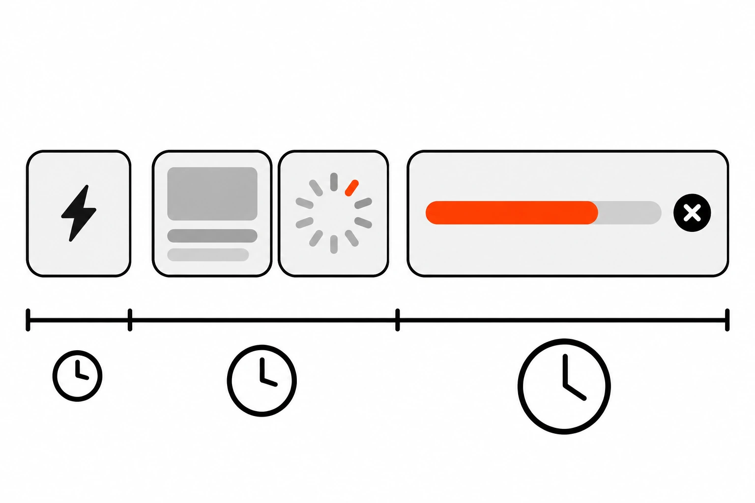
If you’re unsure, ask two questions. Do I know what the screen will look like? Can I measure progress? Yes to the first points to a skeleton. Yes to the second points to a progress bar. No to both, and the wait is short, means a spinner is fine.
How long should you wait before showing a loading indicator?
Wait about a few hundred milliseconds before showing a loading indicator, and once it appears, keep it visible for a short minimum time. Responses under about one second rarely need a loader, and a skeleton or spinner that flashes for a split second feels more like a glitch than feedback.
The response time limits Jakob Nielsen wrote about in 1993 still hold up. In Response Times: The 3 Important Limits, he puts them at 0.1 second (feels instant), 1 second (flow of thought stays intact) and 10 seconds (the limit for keeping attention). Beyond 10 seconds, he recommends a percent-done indicator.
What that means in practice:
- Under 0.1 second, just show the result.
- Up to about 1 second, users notice the delay but don’t need a loader. Immediate feedback on the button press is enough.
- From 1 to 10 seconds, show a skeleton or spinner.
- Over 10 seconds, show real progress and a way to cancel.
The tricky part is that you don’t know in advance how long a request will take. So I use two timers. A delay before showing the loader, and a minimum display time once it’s shown. The numbers below are my own defaults, not research. Tune them for your app.
import { useEffect, useRef, useState } from 'react';

// Show the loader only if loading lasts longer than `delay`,
// and keep it up for at least `minVisible` once it's shown.
export function useDelayedLoading(isLoading, delay = 300, minVisible = 500) {
  const [show, setShow] = useState(false);
  const shownAt = useRef(0);

  useEffect(() => {
    let timer;
    if (isLoading) {
      timer = setTimeout(() => {
        shownAt.current = Date.now();
        setShow(true);
      }, delay);
    } else if (show) {
      const elapsed = Date.now() - shownAt.current;
      timer = setTimeout(() => setShow(false), Math.max(0, minVisible - elapsed));
    }
    return () => clearTimeout(timer);
  }, [isLoading, delay, minVisible, show]);

  return show;
}
Fast responses never show a loader at all. Slow ones show it for at least half a second, so it doesn’t blink on and off. The cleanup function matters here too. If you’ve read my post on Interaction to Next Paint, you’ll know that the first paint after a click should be quick, so the button itself should react right away even while the loader waits its turn.
How do you stop skeleton screens from causing layout shift?
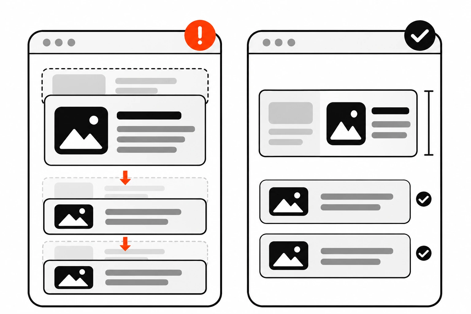
Stop skeleton screens from causing layout shift by giving every placeholder the same size and position as the real content it replaces. Use the same container, grid, spacing and fixed heights or aspect ratios for images. When data arrives, content should swap in place, with nothing below it moving.
A skeleton that’s 120 pixels tall replaced by a card that’s 260 pixels tall pushes everything under it down. Users lose their place, and you pay for it in Cumulative Layout Shift. I wrote a full guide to finding and fixing CLS, and badly sized skeletons are one of the sneakier causes.
The rules I follow:
- Build the skeleton from the same layout component as the real thing. Same grid, same gaps, same padding.
- Give image placeholders the real aspect ratio with
aspect-ratio, not a guessed height. - Match the number of items when you can. If a page usually shows 12 products, render 12 skeleton cards, not 3.
- Size text lines to roughly match real line height, so a two line title becomes two skeleton bars of the same height.
- Pull colors and radius from your design tokens, so the skeleton looks like part of the product, not a gray afterthought.
Here’s a small CSS setup that does most of the work:
.skeleton {
  background: var(--color-surface-muted, #f2f2f2);
  border-radius: var(--radius-md, 8px);
}

.skeleton--text {
  height: 1em;
  margin-block: 0.25em;
}

.skeleton--image {
  aspect-ratio: 16 / 9;
  width: 100%;
}

.skeleton--shimmer {
  background-image: linear-gradient(90deg, transparent, rgb(255 255 255 / 0.6), transparent);
  background-size: 200% 100%;
  background-repeat: no-repeat;
  animation: shimmer 1.5s linear infinite;
}

@keyframes shimmer {
  from { background-position: 150% 0; }
  to { background-position: -50% 0; }
}

@media (prefers-reduced-motion: reduce) {
  .skeleton--shimmer {
    animation: none;
    background-image: none;
  }
}
That last block is the part people forget. More on it in the next section.
How do you make loading states accessible?
Make loading states accessible by marking the loading region with aria-busy="true", announcing short status messages through a polite live region such as role="status", giving progress bars an accessible name, and turning off shimmer animations when users set prefers-reduced-motion. Gray boxes alone mean nothing to a screen reader.
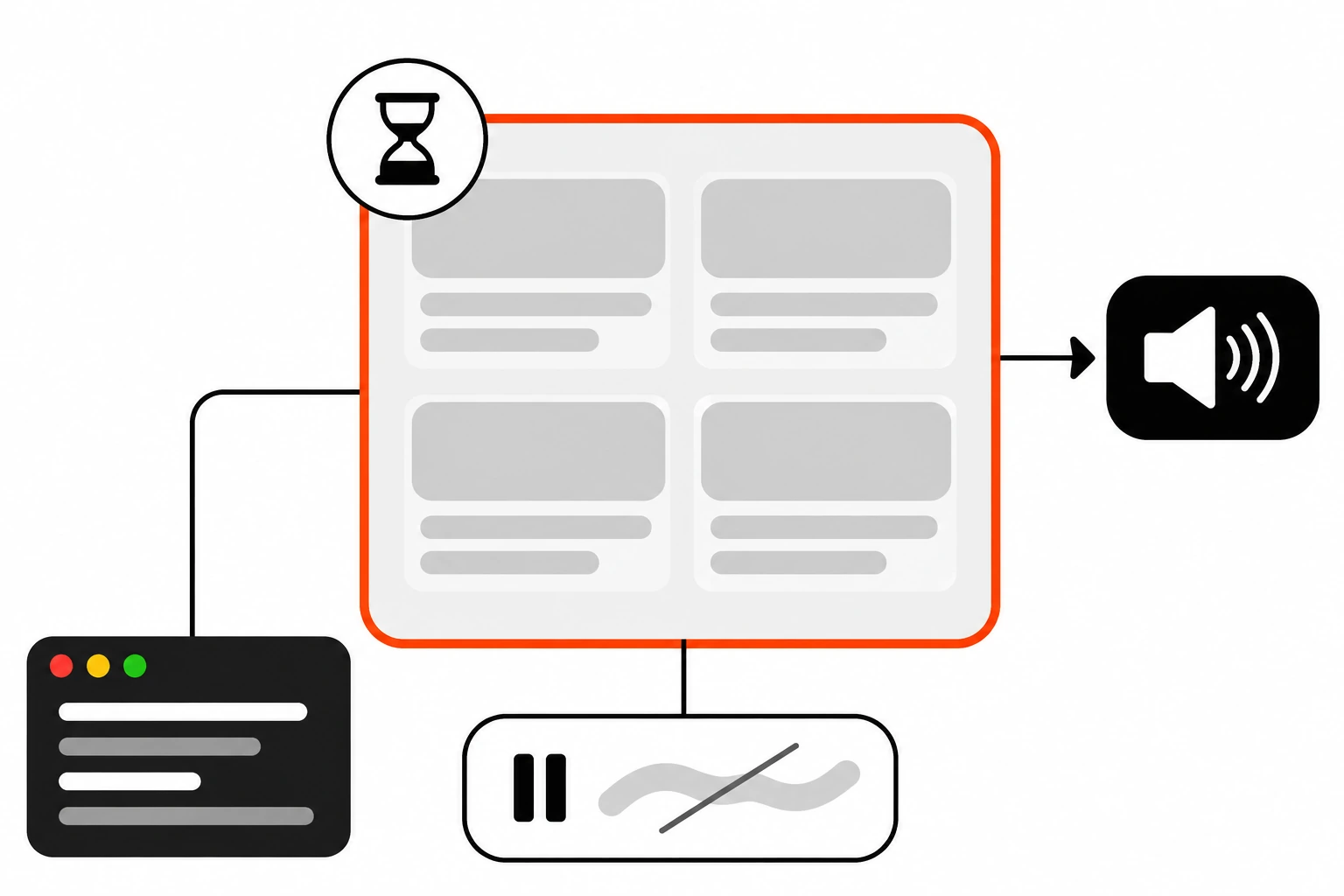
A screen reader user doesn’t see your skeleton. If you don’t say anything, they get silence, then a sudden pile of new content, or nothing at all.
Here’s the pattern I use for a list that loads data:
export function ProductList({ products, isLoading }) {
  return (
    <section aria-labelledby="products-heading" aria-busy={isLoading}>
      <h2 id="products-heading">Products</h2>

      <p role="status" className="visually-hidden">
        {isLoading ? 'Loading products' : `${products.length} products loaded`}
      </p>

      {isLoading ? (
        <ul aria-hidden="true" className="product-grid">
          {Array.from({ length: 12 }, (_, i) => (
            <li key={i} className="skeleton skeleton--card" />
          ))}
        </ul>
      ) : (
        <ul className="product-grid">
          {products.map((p) => <ProductCard key={p.id} product={p} />)}
        </ul>
      )}
    </section>
  );
}
What each piece does:
aria-busytells assistive tech the region is still being updated. MDN’s aria-busy reference explains how it delays announcements in live regions until updates finish.role="status"is a live region with an implicit polite setting, so the message is read when the user is idle, without interrupting them.aria-hidden="true"on the skeleton stops screen readers from reading a dozen empty list items.- The status text changes when loading ends, so users know the content is ready.
Keep the live region in the DOM the whole time and change its text. Live regions that get added at the same moment as their message are often not announced.
Two more things. If the loading state replaces the whole page after a route change, think about where focus goes when it’s done. I covered that in focus management for single page apps. And respect prefers-reduced-motion. A moving shimmer across a whole screen can bother people with vestibular disorders, and NN/g also notes that animated skeletons can be distracting. A static gray skeleton works fine.
How do you build skeleton screens with React Suspense and Next.js?
In React, wrap the part that loads data in <Suspense> and pass a skeleton as its fallback prop. In the Next.js App Router, add a loading.js file to a route folder. Next.js wraps that segment’s page in a Suspense boundary and shows your loading component instantly while the content streams in.
Here’s the plain React version. Each boundary gets its own skeleton, so the parts of the page can appear independently:
import { Suspense } from 'react';

export default function Dashboard() {
  return (
    <main>
      <h1>Dashboard</h1>
      <Suspense fallback={<StatsSkeleton />}>
        <Stats />
      </Suspense>
      <Suspense fallback={<OrdersTableSkeleton rows={10} />}>
        <RecentOrders />
      </Suspense>
    </main>
  );
}
One catch. Suspense only shows the fallback when a Suspense-enabled source suspends, like a framework’s data loading, lazy() components or the use hook with a cached promise. Fetching inside useEffect doesn’t trigger it. For that, you still manage isLoading yourself, like in the hook above.
In the Next.js App Router, it’s even less code. Drop a loading.js (or loading.tsx) next to your page.js:
// app/products/loading.tsx
export default function Loading() {
  return (
    <div className="product-grid" aria-busy="true">
      <p role="status" className="visually-hidden">Loading products</p>
      {Array.from({ length: 12 }, (_, i) => (
        <div key={i} className="skeleton skeleton--card" aria-hidden="true" />
      ))}
    </div>
  );
}
Next.js nests loading.js inside the segment’s layout.js and wraps page.js in a Suspense boundary. Shared layouts stay interactive, and navigation is interruptible, so users can click elsewhere before the new page finishes. The loading UI is also prefetched, which is why it shows up instantly. It pairs nicely with Server Components, since the server can stream the real content in as soon as it’s ready.
A caution from the Next.js docs: if your layout itself reads uncached data, like cookies() or headers(), loading.js won’t show a fallback for it. Keep slow fetches in page.js or wrap them in their own Suspense boundary.
What is optimistic UI, and when does it replace a loader?
Optimistic UI updates the screen immediately as if an action already succeeded, then sends the request in the background and rolls back if it fails. It replaces a loader for small, likely to succeed actions like liking a post, toggling a setting or adding a comment, where waiting adds nothing.
The best loading state is often no loading state. If 99% of “mark as done” clicks succeed, show it as done right away.
React 19 has a hook for this, useOptimistic, which shows a temporary state while an async action runs. You don’t need it, though. Any state update before the request does the same job.
The rules I stick to:
- Only use it for actions that are cheap to undo and very likely to succeed.
- Always handle failure visibly. Roll back the change and say what went wrong.
- Never use it for payments, deletes that can’t be undone, or anything with real consequences.
What are the most common loading state mistakes?
The most common loading state mistakes are flashing a loader on fast responses, skeletons that don’t match the real layout, endless spinners with no timeout or error state, full page loaders for small updates, shimmer that ignores reduced motion, and loading states screen readers never hear about.
I’ve made every one of these, so no judgment here:
- Showing a loader instantly, so fast requests cause a flicker.
- One generic skeleton for every page, which shifts the layout as soon as data lands.
- A spinner with no timeout. If the request fails silently, the spinner spins forever.
- Blocking the whole page with an overlay when only one card is refreshing.
- Hiding content that’s already on screen just to show a skeleton during a refresh. Keep the old data visible and show a small indicator instead. In React, wrapping the update in
startTransitionkeeps already revealed content from being replaced by a fallback. - A progress bar that rushes to 90% and then stalls. It’s better to start slower and speed up near the end, so you never promise more speed than you can deliver.
- Loading states that are purely visual, with no
aria-busyor status message.
Number 3 deserves extra attention. Every loading state needs an exit: success, error or timeout. If you only design the happy path, the loader is where users end up stuck.
Do skeleton screens actually make apps feel faster?
Skeleton screens can make a wait feel shorter and less confusing, because users see structure right away instead of a blank page. They don’t make anything faster, though. If a page takes eight seconds, a nice skeleton is a bandage, and the real fix is cutting the load time.
NN/g says it plainly: skeleton screens don’t replace performance work. I treat them the same way. First I make the data load faster, with caching, smaller payloads, streaming and prefetching. Then I design the loading state for whatever wait is left.
If you remember one thing, make it this. Match the indicator to the wait. Nothing for fast responses, skeleton screens for page and section loads, a spinner for small and short actions, and a real progress bar for anything long. Get the timing and accessibility right, and your loading states stop being something users notice.